Cognito Forms
Cognito Forms makes creating online forms super easy. They’re a small software company in the heart of Columbia, South Carolina. Though they know the importance of great UX, they were only beginning to grow their team large enough to accomodate regular user testing.
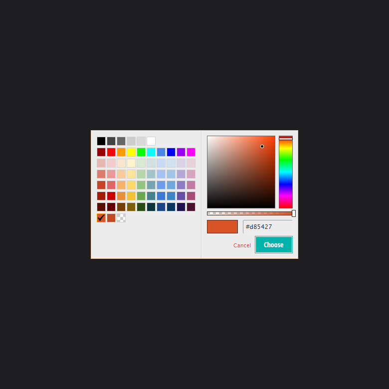
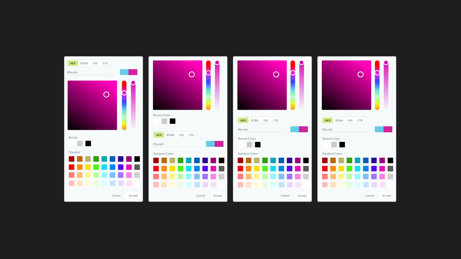
The team began to update their Style Editor, an easy way to customize a form’s appearance — everything from the colors of labels to the font of “buttons” can be changed. It’s a WYSIWYG interface, so it’s intended to be easier to use for people who can’t distinguish between an RGB and HSL color value.
Our larger planned updates to the Style Editor would give even more style options to our users, so nailing small UI details were really important to our success.
Challenge
Overall, we wanted to make sure our UI was simple enough that even someone without experience using a WYSIWYG editor would be able to figure out how to quickly change the appearance of their form.
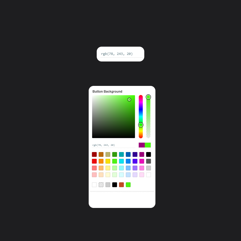
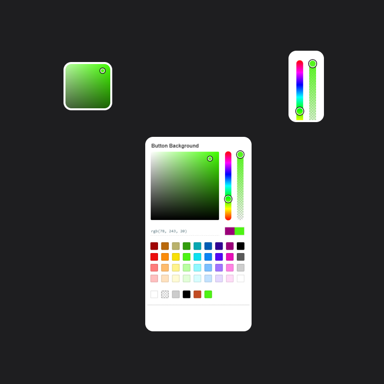
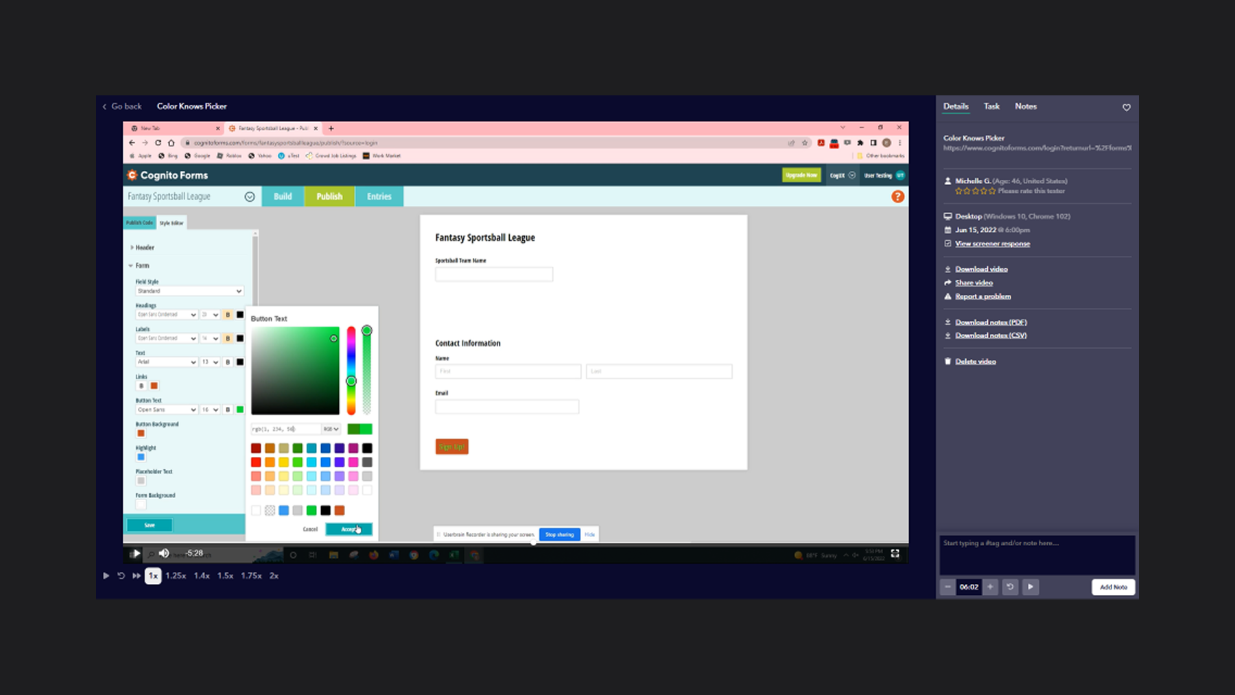
Though there are multiple tools at the heart of the Style Editor, this case study focuses on our UI deep dive work, specifically the eyedropper tool. The eyedropper is used to choose colors for buttons, labels, and many other components on a form.
Big Picture
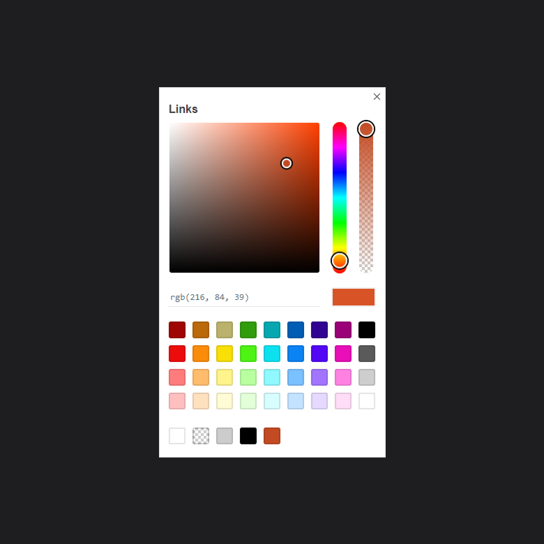
The style editor was launched years before, and users were already used to “how things are”. However, the team knew there were a lot of big changes on the horizon that we planned to make. We rebuilt our eyedropper tool, the tool that’s used to select colors in the editor.
The team had already developed an initial prototype to put into action, this new design was based on other, more popular, eyedropper tools. I made the case to management that this would be a great time to put together a usability test to make sure people could use it, even though an eyedropper is pretty common to designers -- it was important for us to know if ours was up to snuff. On the surface, the new eyedropper UI looked great and seemed easy to use. But it was important that we verify our hypothesis.
I put together a test on Userbrain, researched our audience to make sure we were targeting the right people, designed options to solve UI issues we discovered, and led a series of ideation meetings with other designers. Generally speaking, I found myself the cheerleader for the keeping the process moving.
Goals
We wanted our test to give us better insights into users and their:
- Ability to use color codes
- Interaction with regions such as the color map and sliders.
- Overall pain points with the current iteration of the tool.
Designing the test
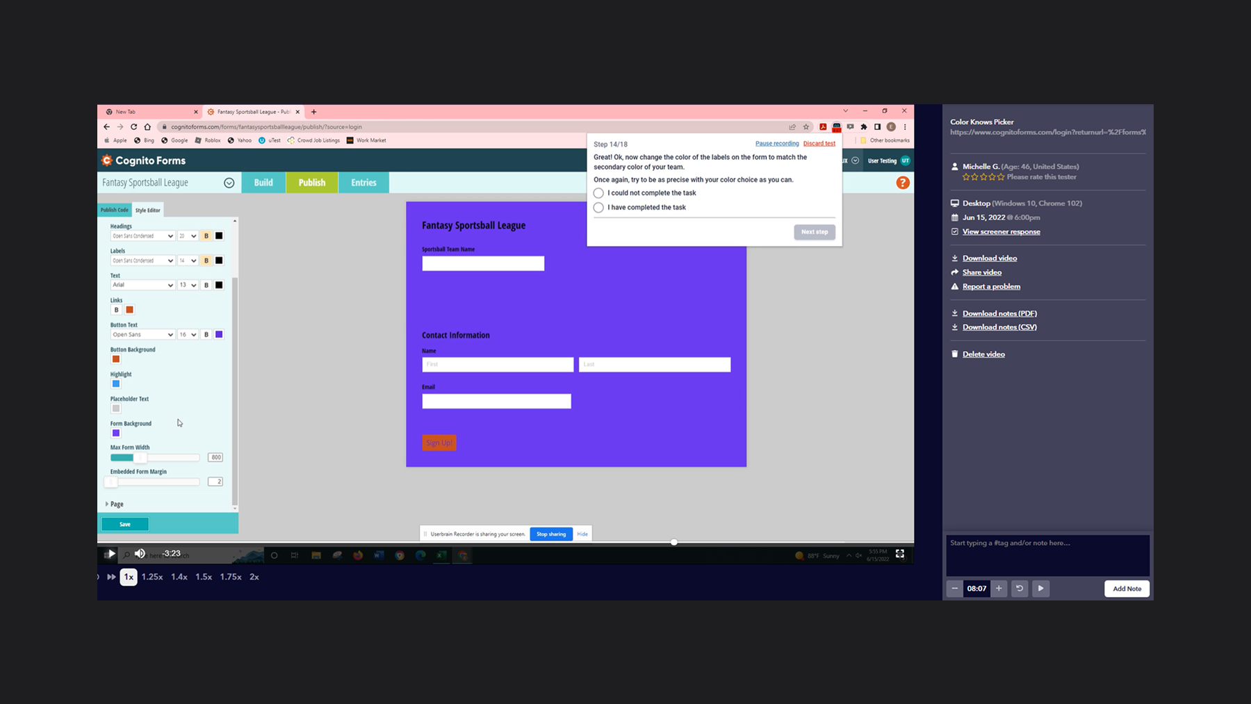
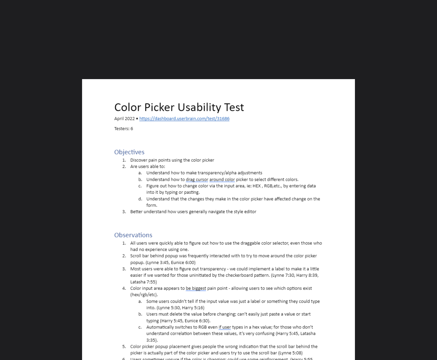
We started by creating a click test on UsabilityHub, but after doing our own walk-throughs, we felt that this wasn’t drawing out the kind of feedback we were looking for. So we quickly adapted our test ideas for Userbrain, defined an audience, and then watched the recordings after users would finish their sessions so that meant we could take notes immediately.
Userbrain lets you define a series of prompts/questions in the browser and records each user’s screen as they step through them. This type of test let us see where users naturally navigated and gave them an open sandbox instead of funneling them through a set path.
Considerations
1
Initially there were questions written to determine the experience level of users so that we could test people who were likely in the beginner “technical literacy” category.
Unfortunately, our first batch of users were clearly not beginners. This made our initial findings unreliable. In order to filter out the more advanced users, we needed better questions to hone in on the target demographics.
After tweaking our audience, the users we began seeing were clearly the beginner types we were hoping for.
Considerations
2
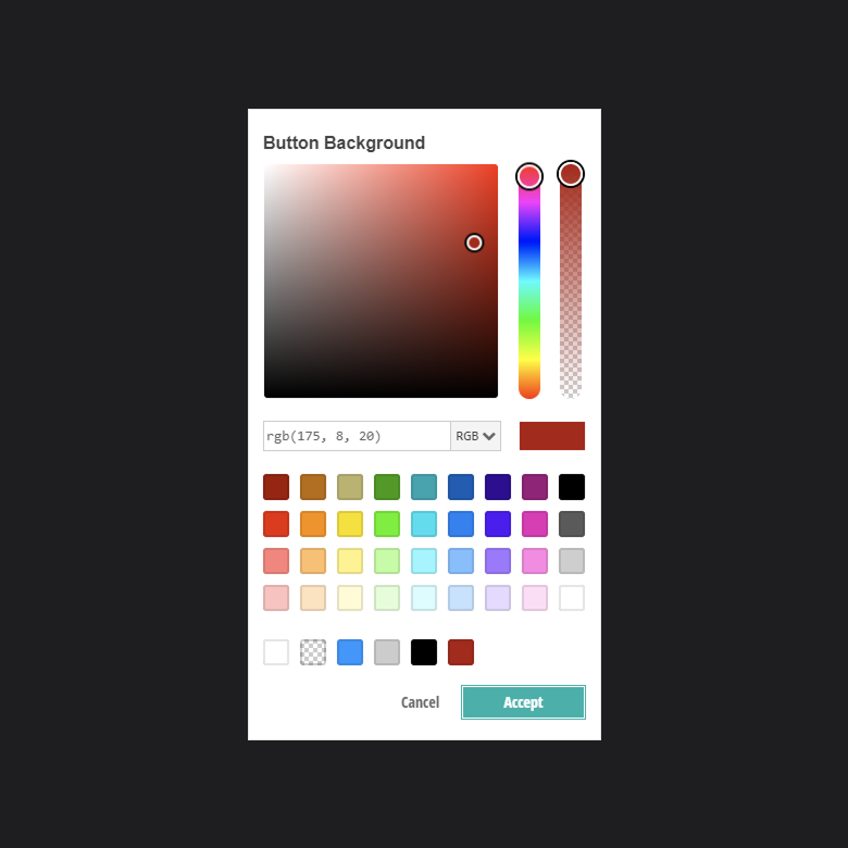
A big challenge for us was to figure out how to get users to “really get in there” and select colors using the gradient color map instead of our presets. But obviously we didn’t want to give users direct instructions. Asking users to select a darker purple would result in users simply selecting a darker preset purple, instead of dragging their cursor to fine tune their choice.
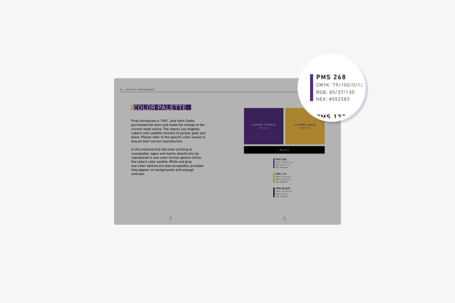
Our Eureka moment was getting users to emotionally invest more into their color choices by prompting them to choose their favorite sports team. After all -- purple isn’t just purple to Los Angeles Lakers fans, right? It’s Lakers Purple.
In fact, the NBA clearly defines it as “Lakers Purple” with #552583 being its precise hex code in their official branding guide. (source). With that thought, we figured there were so many options available to a user to maniuplate their color choices.
Asking users to choose their favorite team, and use their team colors as a starting point, meant that it was more likely for a user to want to make adjustments to a color even if they used a preset to start.
Considerations
3
Lastly, we wanted to be as hands-off as possible. As a team and as a company, this was one of our first experiences user testing the product. So we were naturally curious to see how users reacted to the application as a whole.
In our prompts, we mentioned a style editor as a hint. Aside from that, we left the test as free form as possible to see how users would try to navigate the application to change the colors of their form. We expected this to give us better information to understand how users access the style editor, and we could use our findings to improve our navigation and style editor as a whole at a later time.
Analysis
After users finished, we were able to watch each test and hear the users speak out their thoughts as they walked through the prompts. We could take that feedback, make notes in Userbrain, and quickly throw together a “napkin” empathy map to share with stakeholders. After discussion, we prioritized our three most important insights.
Insights
1
Users didn’t recognize, nor know what to do with, color codes.
Analysis - It wasn’t a surprise that users didn’t know what a color code was. It was more important for us to see if the UI gave strong enough clues at its’ functionality that a user would figure it out. While users did end up going where we intended, the color code input field, they either couldn’t figure out they could change it manually, or change the format entirely, by typing out a hex hashtag, rgb, hsl, etc.
Questions - What could be changed to give better contextual information to the user about color codes and lead to an increase in discoverability?
Insights
2
Users would select a color and wait; appears unresponsive to the user.
Analysis - The feedback in the UI is failing somehow. The lack of a clear call-to-action, in a scenario in which all options aren’t clearly displayed, makes me think that the user just doesn’t know the changes are occurring.
Question - How could we design reliable UI feedback that’s cheap and simple that lets the user know that they’ve changed something successfully, even if the change is off-screen?
Insights
3
Users would select the eyedropper, then get lost.
Analysis - What is occurring after the click event to launch the eyedropper that makes them unaware of how to move forward? Our suspicion is that because of where the popup appears, that it’s simply getting missed because of other things on the screen.
Questions - Could we reduce what’s on the screen so that they notice the popup more easily?
Generating Designs
We had multiple ideation meetings to brainstorm, discuss solutions, and then riff off each others’ work to develop stronger designs.
To move on different ideas fast, we designed in real-time using Figma with our library of custom components.
Being able to generate ideas fast, meant we were putting it into the hands of developers nearly as quickly. And because developers had information quickly, we were able to have all our changes implemented in a user testing environment and ready for retesting before the end of the sprint.
Solutions
1
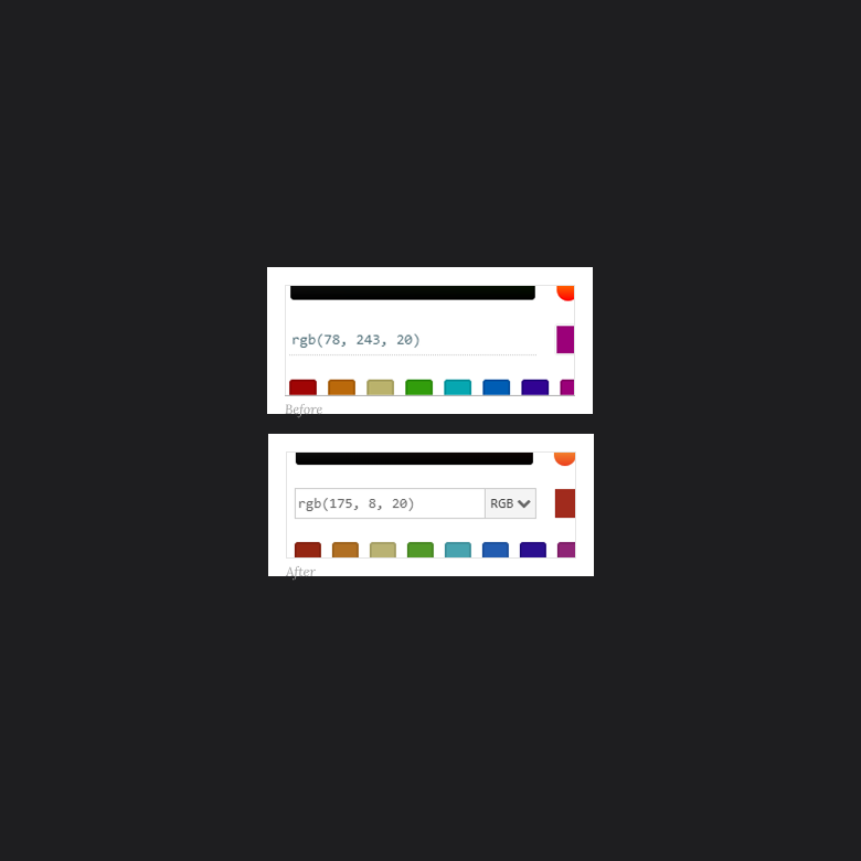
Input Area changes:
- Change the background of the text area to suggest that it’s an input field that can be manipulated and not simply a display.
- When a user focuses the field, highlight the field to indicate to a user that they can change it.
- Add a dropdown to allow users to pick HEX/RGB/HSL. Allow users to type out a # or RGB and toggle the dropdown selection based on the type of code the user has entered.
Solutions
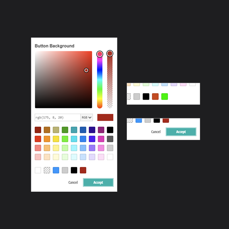
2
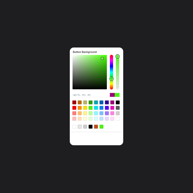
Since it’s not feasible to show every UI component to a user so they can see their changes in real-time, I made a strong case for adding the Accept and Cancel buttons back into the mix. Originally, they were removed in our prototype to give the tool a simpler feel. And even though it’s visually appealing to have less, it left the user unaware if they had changed something or not.
There was pushback from the team because there’s a great case to be made by keeping things stripped down and simple, but I stood my ground and argued that adding the buttons back would cost us nothing, as it would merely be a placebo effect. I further made the case that it’s a ridiculously cheap solution to test and observe since the Accept button just needed to close the popup -- no new functionality would need to be written. If this solution didn’t work, we wouldn’t lose anything.
Solutions
3
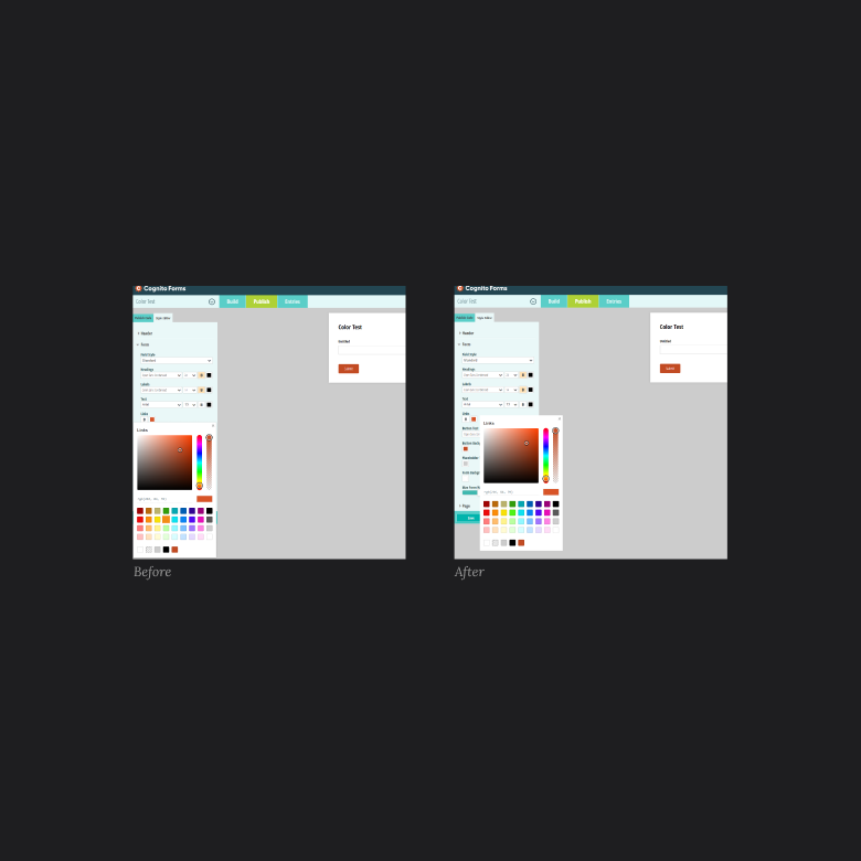
After watching several users get lost after clicking the eye dropper, it seemed to us that the core issue was placement. The tool was set to appear under a color swatch when clicked, and that made sense for a horizontal tool -- aka the original color picker. But when we switched to a vertical orientation, the tool appeared within the confines of the sidebar to most users. That meant it was likely just getting lost in the mix when clicked. Adjusting the tool’s popup anchor point was a simple enough change, but had a huge impact - users rarely got lost after clicking the swatch after the change.
Retest and Verify
Once the changes hit our user testing environment, we were quickly able to run retests in Userbrain to verify our changes had the intended impact, and to see if there were any surprises. We were able to:
- Verify that there was a huge improvement in finding the input field and realizing it could be edited, but the dropdown also helped users learn the types of color codes. We did run into two issues though, one was a technical bug, and the other was a CSS change to make the cursor a pointer when hovering over the dropdown.
- Determine that the placebo effect “trick” worked with the Accept and Cancel buttons. Users seemed way more confident in their selection and didn’t wait around for something to happen.
- See that changing the anchor point meant the UI was appearing in a more effective position. But we still felt like this could use more improvement, and decided to escalate it as a higher severity technical issue for our developers to address.
Final thoughts
It’s critical to test changes as often as possible, ideally when they’re still small. The design and development teams were able to walk away with a wealth of information to create and prioritize user stories for optimizations, “down the road”. And we, the design team, were able to use the momentum of our success to further improve our style editor.
In this example, you see that even user testing components is important as those small issues can compound into user frustrations; instead, we should test often so that we can create great user experiences.